Additional Options Menu
Description
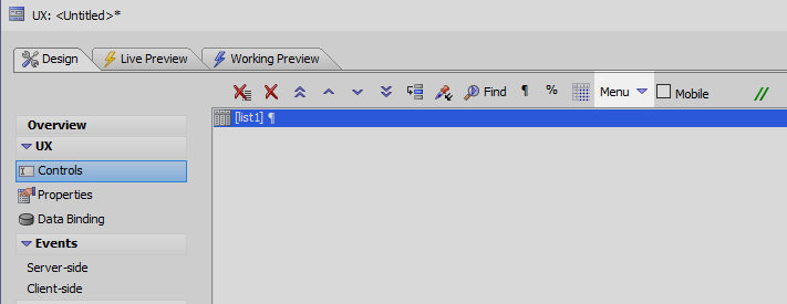
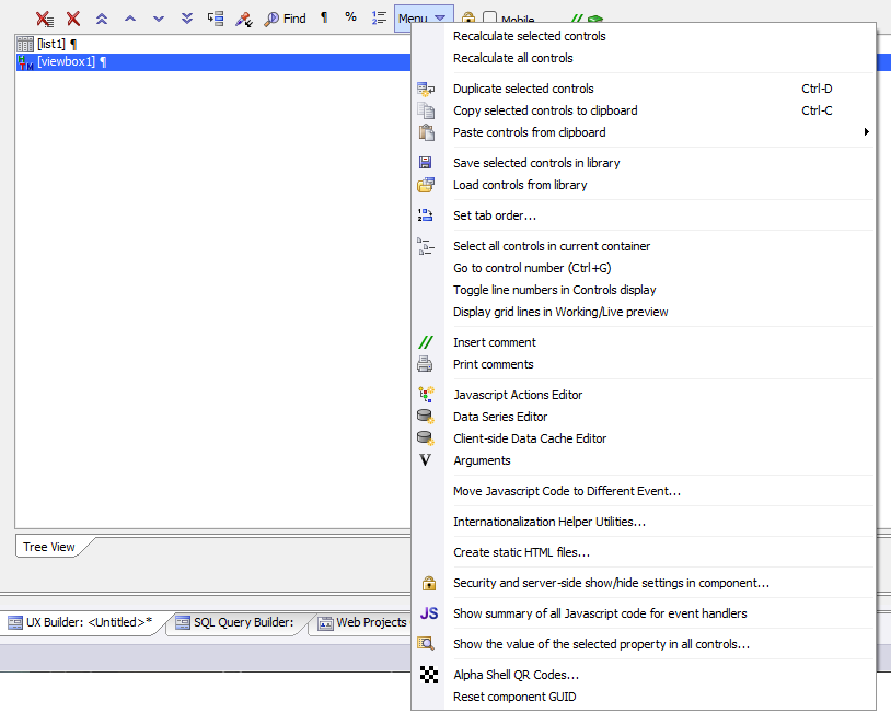
The toolbar in the UX Controls page contains a 'Menu' dropdown list with a number of useful tools and options.
- Name
- Description
- Arguments
Opens the Define Arguments Dialog that lets you define arguments.
- Client-side Data Cache Editor
Download and store data - files, images, data from a SQL database, etc - locally on the client using the Client-side Data Cache. Data stored on the client can be referenced locally using JavaScript and is available offline in mobile applications.
- Copy selected controls to clipboard
Copies highlighted controls to the clipboard. The controls can then be pasted onto a separate UX component using the '[Paste Controls from Clipboard]' command. If you want to duplicate controls within a UX page use the '[Duplicate selected controls]' option.
- Create static HTML files
Generate a static HTML version of your UX component. Several different files will be generated (e.g. .html, .css, .js, etc.). The collection of files is referred to as a 'fileset'. You must save the component that you want to convert to HTML before you can use this feature.
- Data Series Editor
The Data Series Editor allows you to create Data Series before creating a control that uses the data in that data series; for example a list control or a button list control.
- Duplicate selected controls
This option makes a copy of any highlighted controls in a component's controls tree. This copy is then added directly to the controls tree. This provides a quicker way of duplicating controls than can be achieved by [copying] and [pasting] them to and from the clipboard, which is also a option. When a control is duplicated it automatically receives a new name, in order to differentiate it from existing controls.
- Go to control number (Ctrl+G)
Go to control number simply jumps to a specified line number in the controls tree on the UX Controls page. This feature is particulary effective when a component contains a large number of controls and the [line number toggle feature] is turned 'on'.
- Insert comment
Here
- Internationalization Helper Utilities
Makes it easy to add language tags to different parts of an application
- Javascript Actions Editor
Opens the Javascript Actions Editor which allows for the creation of unbound events.
- Load controls from library
If you have saved controls to the controls library using the '[Save selected controls in library]' option in the Additional Options Menu, you can then use the 'Load controls from library' option to load those controls into new UX components.
- Move Javascript Code to Different Event
This option provides an easy means of automatically moving javascript from one event to another; without having to redefine javascript actions or code inside a control. For example, if you create a button that fires a javascript action when it is clicked you can use this option to make that action fire when the button is double clicked instead.
- Paste controls from clipboard
Pastes copied controls from the clipboard onto the current or separate UX component.
- PhoneGap Shell QR Codes
Generate QR Codes for the UX Component name or Server Address for loading and testing Cordova applications in the PhoneGap-Shell-V2 (Cordova shell).
- Print comments
Print all of the comments in a UX component.
- Recalculate all controls
Recomputes the underlying Xbasic definition for all controls in a UX Component.
- Recalculate selected controls
Recomputes the underlying Xbasic implementation for the selected controls in UX Component.
- Save selected controls in library
When building multiple UX components, it can become tiresome to have to re-create identical controls multiple times. One way to avoid this is to create a control and then save that individual control in the controls library. You can save controls using the Additional Options menu on the UX Controls page.
- Security and server-side show/hide settings in component
Here
- Select all controls in current container
Highlighting a container inside the controls tree and then clicking on the 'Select all controls in current container' option will select all of the controls inside of that container. This can be useful if you have containers that include a large number of controls or if you have a series of nested containers in a component.
- Set Tab Order
- Show the value of the selected property in all controls
This is a convenient means of comparing a given property value across multiple controls. When you have a number of defined controls with given property defined on the UX Controls page, you can select that property in the properties list of one control and then use this option to see the values of that property in all of the other controls on your component.
- Toggle line numbers in Controls display
This option adds line numbers to the side of the controls tree, or removes the line numbers if they are already present.